
Researchers have documented a measurable phenomenon known as the “north-south bias” in human psychology. Because mapmakers have consistently placed north at the top of the page, people subconsciously link northern locations with positive traits. Studies show that individuals associate northern areas with wealthier residents, more expensive real estate, and higher altitudes.
Conversely, they associate southern locations with poorer populations, cheaper prices, and lower altitudes. However, when researchers present test subjects with south-up maps, this geographic bias completely disappears. The association occurs because humans generally link vertical upward positions with positive attributes like high status and profits.
How Everyday Language Reinforces the Map
Everyday language heavily reinforces the connection between map orientation and perceived social status. English speakers frequently use common directional phrases like “heading up north” or traveling “down south.” This vertical association extends directly into socioeconomic descriptions in popular culture and music.
The term “Uptown” is commonly used to describe high-class or wealthy areas. Meanwhile, “Downtown” often conveys a lower socioeconomic status. These idioms rely entirely on repeated visual exposure to standard north-up maps.
An Artist Flips the Continents
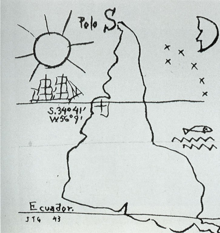
The practice of rotating the map to make a political statement began in the early twentieth century. Reversing the orientation of a map is technically a very easy process. In 1943, the Uruguayan modernist painter Joaquín Torres García created an ink drawing titled “América Invertida.” In his specific artwork, he placed the South Pole at the top of the earth. By positioning South America at the visual peak of the drawing, the artist visually elevated the importance of the continent in relation to Europe and North America.
The Universal Corrective World Map
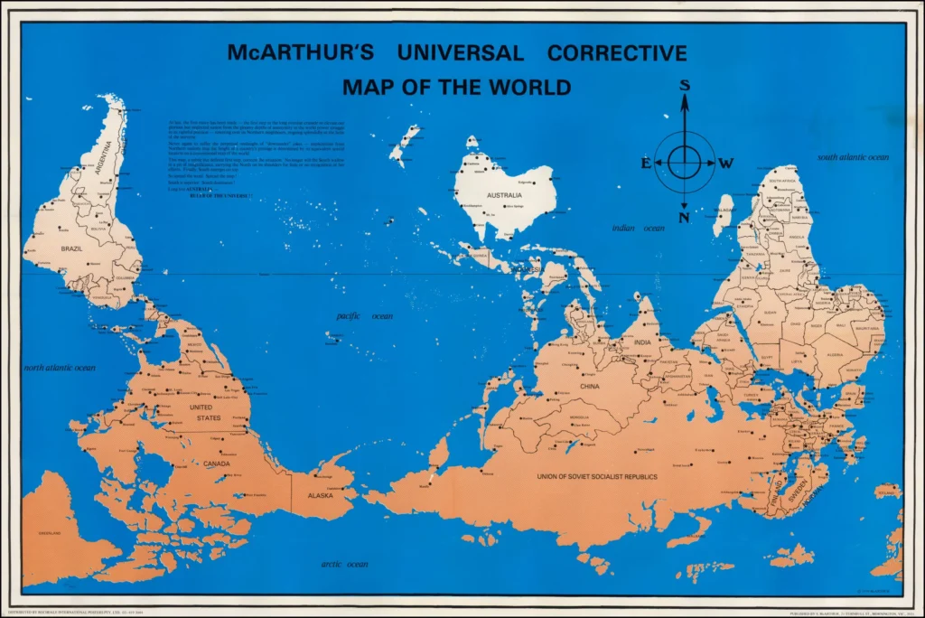
In 1979, a 21-year-old Australian named Stuart McArthur officially published “McArthur’s Universal Corrective Map of the World.” At age 15, while studying abroad as an exchange student, his classmates repeatedly taunted him for coming from “Down Under.” In response, he published a world map that placed Australia exactly at the top center of the page. The inset on his map explained that he wanted to confront the perpetual jokes from northern nations.
Today, educators frequently use these rotated maps in cultural diversity classes to force students to view the world from a different perspective. South-up maps also appear in popular culture, including episodes of the television show The West Wing and the computer strategy game Neocolonialism.